

15 Wall Molding Ideas That Make Plain Walls Look Expensive
Plain walls aren’t necessarily bad. Sometimes they’re just… waiting for something.
And that “something” doesn’t have to be expensive wallpaper, custom millwork, or a renovation that somehow involves six contractors and a temporary kitchen.
A few thoughtfully placed strips of molding can completely change how a room feels.
The best wall molding ideas add architecture where there wasn’t much to begin with. They can make a builder-grade living room feel more polished, give a bedroom a custom look, or turn a forgettable hallway into an actual design feature.
Better yet, molding can work with almost any style. Traditional picture-frame molding feels elegant. Box molding can be clean and contemporary. Chair rails add structure, while full-height treatments create serious impact.
The secret is proportion.
If the molding relates to the room, furniture, doors, and ceiling height, even relatively inexpensive materials can look surprisingly high-end.
Here are 15 wall molding ideas worth stealing.
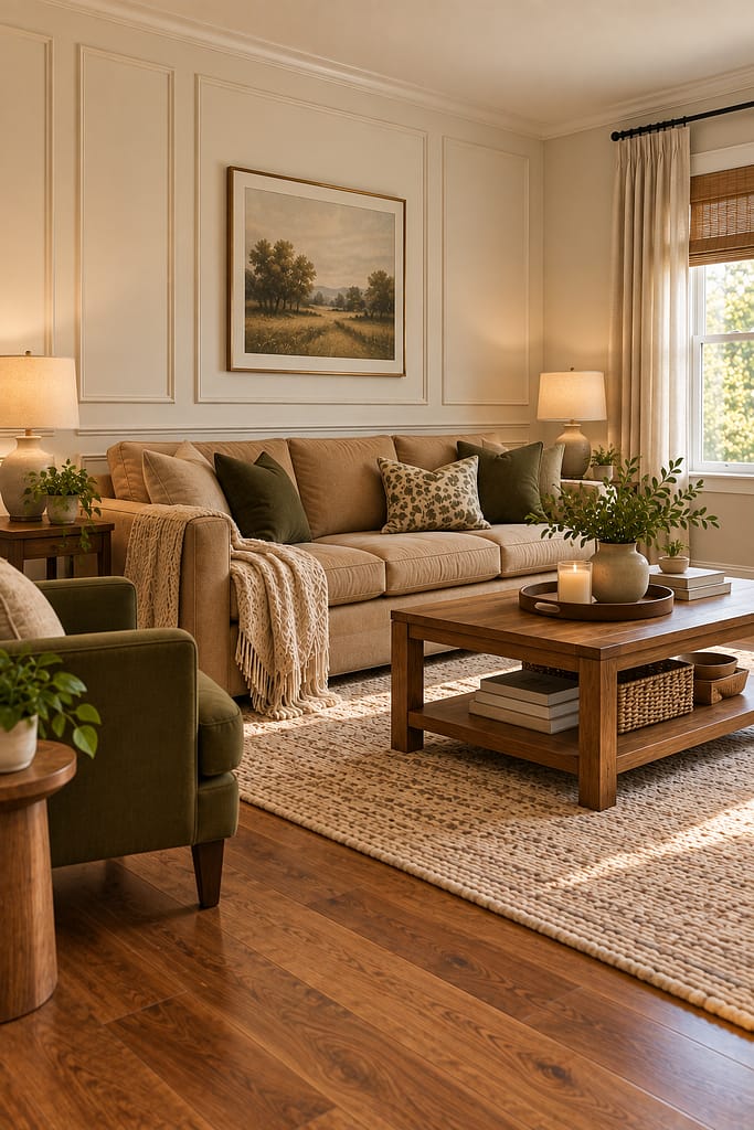
1. Add Classic Picture-Frame Molding
Picture-frame molding is probably the easiest place to start if you want an expensive-looking wall without covering it completely.
Thin molding strips are arranged into simple rectangular frames directly on the wall.
Paint everything the same color for a seamless architectural effect.
Warm white feels classic.
Greige looks softer.
Muted olive can make the treatment much more dramatic.
For a standard 8-foot ceiling, keep the proportions restrained rather than creating enormous rectangles designed for a ballroom.
Plan the layout before cutting anything.
Measure the entire wall, account for outlets and switches, and keep spacing consistent.
Those little differences you think nobody will notice?
You will.
Every day.
From the sofa.
Forever.
2. Create Floor-to-Ceiling Box Molding
For more impact, extend molding from near the baseboard toward the ceiling.
Large full-height rectangular panels can make a plain wall feel much more architectural.
This works beautifully behind a sofa, dining table, bed, or console.
Keep the number of panels appropriate for the wall width.
Three well-proportioned boxes usually look better than squeezing in seven skinny ones simply because technically you can.
Paint the molding and wall the same color.
That keeps the effect sophisticated rather than overly decorative.
Warm white is safe, but soft greige or muted olive can make the molding shadows more visible.
Keep panel spacing consistent.
Expensive-looking millwork is mostly geometry wearing paint.
The geometry needs to behave.

3. Paint Wall Molding a Muted Olive Green
Want the molding to feel richer?
Paint the entire feature wall—including the molding—muted olive green.
The single-color treatment allows light and shadow to define the pattern.
Pair it with cream upholstery, medium walnut, natural linen, and restrained black or aged-brass accents.
This works particularly well in dining rooms, bedrooms, offices, and cozy living rooms.
Choose a green with warm or neutral undertones rather than something extremely saturated.
And test the paint in the actual room.
The shadows inside molding panels naturally make portions of the wall look darker.
Your tasteful olive sample can become dramatically moodier once multiplied across 150 square feet.
Paint enjoys revealing personality only after you’ve bought several gallons.

4. Add Molding Behind the Bed
Instead of buying an oversized decorative headboard, let the wall provide the architecture.
Create three large molding panels behind the bed, with the center panel aligned to the bed.
Paint everything warm greige, cream, dusty blue, or another muted shade.
A medium-walnut bed creates beautiful contrast.
Keep artwork optional.
If the molding already fills the wall nicely, you may not need anything above the headboard.
That’s part of the appeal.
You get a finished-looking bedroom with fewer objects.
Just plan around outlets, switches, sconces, and existing trim before settling on panel dimensions.
Molding should look like it has always belonged there.
Not like it arrived on Saturday and discovered an outlet halfway through installation.

5. Create Half-Wall Box Molding
You don’t need to take molding all the way to the ceiling.
Install rectangular box molding across the lower portion of the wall and finish it with a simple horizontal trim or chair rail.
Keep the upper wall plain.
This works especially well in dining rooms, hallways, entryways, and bedrooms.
For a classic look, paint the lower molding warm white and use warm greige above.
For something more contemporary, paint the entire wall one color.
Half-wall molding introduces detail without making a small room feel too formal.
It also works nicely when you want to hang artwork above without competing with full-height panels.
Basically, the lower wall does the architectural work.
The upper wall gets to relax.
Healthy division of labor.

6. Use Thin Molding for a Modern Look
Wall molding doesn’t have to feel traditional.
Use thin, simple trim arranged in large clean rectangles for a more contemporary result.
Skip ornate profiles.
Keep the panel layout minimal.
Paint everything the same warm white, greige, or mushroom color.
Pair the wall with clean-lined furniture and limited accessories.
This is especially useful in newer builder-grade homes where highly decorative molding might feel disconnected from the existing architecture.
Thin trim gives you depth without pretending the house is a 19th-century Parisian apartment.
There’s nothing wrong with your suburban living room.
It doesn’t need a fake aristocratic backstory.
Give it architecture that makes sense for what it is.

7. Create a Moody Burgundy Molding Wall
Deep color makes simple molding considerably more dramatic.
Try a muted burgundy or dusty plum wall with matching molding.
Use it in a dining room, reading room, bedroom, or home office.
Pair the rich wall with cream textiles, walnut furniture, and small aged-brass details.
Keep the molding profile fairly simple.
The color is already doing plenty.
Warm lighting helps burgundy feel cozy rather than heavy.
This approach can look particularly expensive because the panel shadows create subtle variations in one color.
Just sample carefully.
You want sophisticated wine tones.
Not a wall that looks like it was sponsored by ketchup.
There’s a surprisingly fine line.

8. Add Molding to a Narrow Hallway
Hallways are frequently treated as spaces you simply walk through.
Molding can make them feel intentional without consuming floor area.
Install lower-wall picture-frame molding along both sides, or use a few tall panels on the longer wall.
Warm white or soft greige keeps a narrow hallway light.
Add a few appropriately sized framed artworks above the lower molding if desired.
Keep frames shallow so they don’t project excessively into the passage.
And don’t overfill the walls.
A narrow hallway with ten molding boxes and fifteen frames can become visually exhausting surprisingly quickly.
You want architectural rhythm.
Not an obstacle course for the eyes.

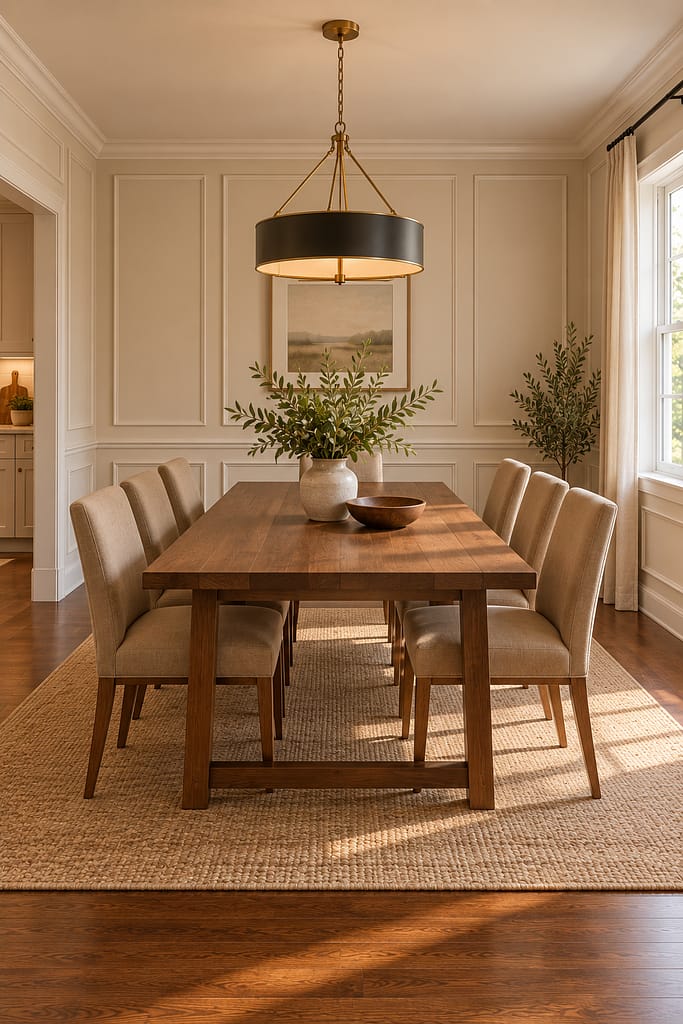
9. Frame a Dining Room With Wall Panels
Dining rooms are perfect for slightly more formal molding.
Create evenly spaced rectangular panels around the room, aligning them thoughtfully with the table, doors, windows, and major furniture.
Paint everything warm cream for a subtle effect.
Or use mushroom greige for more visible shadows.
Add a medium-walnut dining table and simple upholstered chairs.
A restrained pendant can complete the room without competing with the walls.
The key is alignment.
If one panel stops awkwardly against a door frame while another floats six inches away from a corner, the room can feel improvised.
Plan the entire wall elevation first.
Yes, graph paper may become involved.
No, this does not mean you’ve become boring.
It means your molding might actually line up.
10. Combine Wall Molding With Wallpaper
Can’t decide between molding and wallpaper?
Use both—but give each one a defined job.
Install box molding or wainscot-style molding on the lower wall, then add a restrained wallpaper above.
Choose a small botanical, subtle stripe, or muted geometric pattern.
Keep the wallpaper palette connected to the molding color.
For example, warm-white molding works beautifully beneath olive-and-cream botanical wallpaper.
This approach suits dining rooms, powder rooms, bedrooms, and entryways.
Don’t use an extremely elaborate molding profile with an extremely elaborate wallpaper unless maximalism is genuinely the goal.
Two stars fighting for top billing rarely ends peacefully.
Let one lead.
Let the other support.
Interior diplomacy.

11. Add Wall Molding Around a Fireplace
Molding can help integrate a fireplace into the architecture of a room.
Create symmetrical molding panels on the walls beside the fireplace, or use restrained panel molding above an appropriately constructed mantel area where suitable.
Keep the fireplace surround itself simple.
Warm white molding with a medium-walnut mantel creates a classic combination.
Muted greige offers a softer look.
If the fireplace is functional, decorative wood trim and other combustible materials must respect manufacturer-required clearances and applicable requirements.
Don’t sacrifice safety for symmetry.
If the panel dimensions need to shift slightly to stay outside a required clearance, the wall will survive emotionally.
So will Pinterest.

12. Use Square Box Molding in an Entryway
Tall rectangles aren’t your only option.
A grid of larger square or nearly square molding panels can create a slightly more modern look.
Use it behind an entry console or bench.
Paint the entire wall warm cream, dusty olive, or greige.
Center the furniture within the panel arrangement.
Add one securely mounted mirror rather than covering the wall with small accessories.
Square panels work particularly well on shorter walls where tall narrow rectangles would feel cramped.
Keep the grid simple.
You are adding architectural interest.
You’re not recreating a spreadsheet in lumber.
Four or six balanced panels may be plenty.

13. Create a Two-Tone Molding Wall
Two-tone walls can make molding more noticeable without requiring a dark room.
Use deeper color below a chair rail and a lighter shade above.
For example, muted olive below with warm cream above.
Dusty blue and soft white also work.
So do mushroom greige and pale cream.
Keep the molding itself the same color as the lower section for a cohesive look.
This works beautifully in dining rooms, entryways, and bedrooms.
Position the color transition based on the room’s proportions and existing architectural features rather than automatically dividing the wall exactly in half.
Perfect mathematical equality isn’t always visually perfect.
Walls, annoyingly, have opinions about proportion.

14. Add Molding Around a Home Office Desk
A desk pushed against a blank wall can feel temporary.
Framing the area with molding makes it look intentionally designed.
Create two or three large molding panels behind the desk.
Use warm greige, dusty blue, or muted olive.
Center the desk within the overall composition rather than necessarily inside one individual panel.
Keep storage simple.
A compact drawer unit is often more useful than loading the wall with decorative shelves.
If shelves are necessary, install them with proper structural support.
Molding is decorative.
It does not provide magical reinforcement for your book collection.
Sadly, decorative trim remains unwilling to violate physics.

15. Create a Full-Room Wall Molding Treatment
If you want maximum impact, carry a consistent molding design around the entire room.
Use simple rectangular panels with consistent spacing, adjusting their widths thoughtfully around doors, windows, and corners.
This works especially well in dining rooms, bedrooms, and formal living rooms.
Paint the molding and walls one color for the most cohesive effect.
Warm cream feels timeless.
Mushroom greige looks relaxed.
Muted olive creates more drama.
Keep furniture and decor slightly simpler because the architecture is already adding plenty of detail.
And plan the whole room before buying trim.
One wall designed in isolation can create very strange conversations when it eventually meets the next wall at the corner.
Corners expose everything.
They have no loyalty.

How to Make Wall Molding Look Expensive
The biggest secret isn’t the molding profile.
It’s proportion and precision.
Simple inexpensive trim can look polished when every panel is aligned, spacing is consistent, corners are clean, and the paint finish is smooth.
Before installing anything, draw the entire wall.
Include doors, windows, outlets, switches, baseboards, crown molding, furniture, and other fixed elements.
Then calculate your panel dimensions.
Avoid ending with one strange skinny rectangle because you started measuring from the opposite side and hoped geometry would become cooperative.
It rarely does.
A planned layout almost always looks more custom.
Choose the Right Wall Molding Style
Different molding layouts create different moods.
Picture-frame molding uses thin rectangular frames and works with traditional, transitional, and contemporary interiors.
Box molding is a broad term often used for similar rectangular panel layouts.
Chair rails create a horizontal division across the wall.
Wainscoting typically describes a decorative treatment on the lower portion of a wall and can incorporate molding, panels, beadboard, or other details.
More elaborate raised-panel systems feel more formal.
For most attainable modern homes, simple picture-frame molding gives you plenty of impact without fighting the existing architecture.
You don’t need palace-level millwork.
Your living room knows where it lives.
Wall Molding Ideas for 8-Foot Ceilings
Standard ceilings can absolutely handle molding.
The trick is avoiding proportions designed for much taller rooms.
Use relatively slim molding profiles.
Keep upper margins comfortable.
Avoid making panels so tall and narrow that the wall looks stretched.
Three or four balanced panels across a normal living room wall may be enough.
Vertical rectangles can subtly emphasize height.
Half-wall molding can also work beautifully because it leaves visual breathing room above.
Mock up the design with painter’s tape before cutting.
This lets you judge proportions from across the room.
Your tape lines may look slightly ridiculous for an evening.
Better that than permanently ridiculous molding.
Wall Molding Ideas for a Small Room
Small rooms benefit from restraint.
Use fewer, larger panels rather than many tiny rectangles.
Paint the molding the same color as the wall to reduce visual clutter.
Warm white, cream, greige, and mushroom tones are easy choices.
You can still use dark colors if you want a cozy effect.
A small room doesn’t automatically need to be painted white to earn the right to exist.
Just balance deeper walls with adequate lighting and lighter furnishings.
Keep furniture placement in mind when planning panels.
There’s little value in designing intricate molding that disappears entirely behind a wardrobe.
How High Should Wall Molding Be?
There’s no universal measurement that works for every room.
Full-height picture-frame molding should relate to the baseboard, ceiling, furniture, and wall width.
Chair rails and lower-wall treatments should be placed according to the room’s proportions and desired effect rather than blindly dividing the wall in half.
Use existing architecture as a guide.
Window sills, door trim, counters, furniture backs, and other horizontal lines can influence where a molding transition looks natural.
Painter’s tape is extremely useful here.
Try several heights.
Walk away.
Return later.
Stare at them excessively.
This is a legitimate part of interior design.
Plan Molding Around Outlets and Switches
Outlets and switches are part of the wall whether Pinterest likes them or not.
Include them in your layout from the beginning.
Whenever possible, design panels so molding doesn’t awkwardly run directly through electrical cover plates.
Don’t relocate or modify electrical devices casually just to improve symmetry.
Electrical work should be handled appropriately and comply with applicable requirements.
Sometimes adjusting a panel by an inch is much easier than moving an outlet.
Architecture occasionally needs to compromise with electricity.
Electricity tends to win.
Paint the Wall and Molding the Same Color
One of the easiest ways to make wall molding look sophisticated is to paint both the trim and wall the same color.
The design then relies on light and shadow rather than contrasting stripes.
Warm white creates a subtle effect.
Greige adds depth.
Olive makes the architecture more visible.
Burgundy or charcoal creates drama.
The finish can vary depending on the desired effect and paint system, but using one cohesive color keeps even inexpensive molding from looking overly applied.
It feels architectural rather than decorative.
That’s usually the goal.
Should Wall Molding Contrast With the Wall?
It can.
White molding over a colored wall creates a more traditional, high-contrast look.
This can work beautifully in historic-inspired rooms.
But for a calmer modern effect, matching the molding and wall color is often easier.
If you want contrast without creating strong outlines, use a two-tone wall instead.
For example, olive lower molding with cream above a chair rail.
That creates definition while still grouping the lower architectural treatment together.
There is no mandatory answer.
Just decide whether you want the molding itself to be the feature or whether you want the overall wall architecture to do the work.
Wall Molding Ideas for a Living Room
The sofa wall is an obvious starting point.
Create three large panels behind the sofa.
Center the middle panel with the furniture arrangement.
Another option is adding symmetrical panels beside a fireplace.
Full-room molding can work if the living room is relatively simple.
Keep art placement coordinated with the panels.
Don’t randomly hang frames across molding lines unless the design intentionally calls for it.
The wall already has structure.
Use it.
A beautiful panel centered behind a piece of art looks considered.
A picture frame floating halfway across two rectangles looks like the wall and artwork stopped communicating.
Wall Molding Ideas for a Bedroom
Behind the bed is usually the strongest location.
Three tall panels can frame a queen or king bed beautifully.
A single larger central panel can work too.
Try warm greige for a quiet bedroom.
Muted olive creates an earthy mood.
Dusty blue feels soft.
Burgundy brings drama.
If you’re using bedside sconces, include them in the molding plan before installation.
Make sure electrical fixtures are installed appropriately.
You don’t want to finish a perfectly symmetrical wall and then discover the light needs to land directly on top of your carefully installed trim.
The wall will not appreciate the plot twist.
Wall Molding Ideas for a Dining Room
Dining rooms can handle slightly more architectural detail.
Full-room picture-frame molding feels elegant without taking up floor space.
Half-wall molding with a chair rail is another classic choice.
Wallpaper above lower molding can introduce pattern.
A deep monochromatic color can make simple molding look dramatic.
Coordinate panel widths with the dining table and major wall features.
And remember that chairs need clearance.
Molding itself doesn’t consume meaningful room depth, which makes it particularly useful when the dining room is small.
You get visual richness without sacrificing the ability to pull out a chair.
Practical luxury.
Wall Molding Ideas for a Hallway
Hallways are excellent candidates because molding adds interest without adding furniture.
Use lower-wall box molding for a classic treatment.
Or add tall panels to one long wall.
Keep the design relatively simple.
Hallways already contain multiple doors, trim lines, switches, and sightlines.
Too many additional rectangles can make the architecture feel chaotic.
Repeat panel dimensions where possible.
Paint everything one color.
Then add only a few pieces of art.
The hallway doesn’t need to become an art museum simply because it finally has molding.
Wall Molding Ideas for an Entryway
A small entry can feel instantly more finished with molding behind a console or bench.
Use square panels on a short wall.
Try vertical rectangles on a taller or wider wall.
Add one mirror centered within the arrangement.
Muted olive, warm cream, and mushroom greige all work beautifully with walnut furniture.
Keep the floor route and door swing clear.
Molding is useful here because it provides decoration without physically projecting into the room.
In a narrow entrance, every inch counts.
The wall can be fancy.
The walkway needs to remain employed.
Wall Molding With Wallpaper
Wallpaper and molding can make a room feel highly customized.
The easiest combination is lower-wall molding with wallpaper above.
Choose a restrained wallpaper pattern if the molding is detailed.
If the molding is extremely simple, you can use a slightly stronger print.
Repeat colors between both elements.
For example, olive botanical wallpaper above cream molding creates continuity.
Install wallpaper and trim according to the respective product instructions and wall conditions.
If you’re new to both projects, attempting complicated wallpaper and complicated molding simultaneously may be an ambitious weekend.
Know your relationship with patience.
How to Choose Molding Size
Look at the existing trim in your home.
If your baseboards and door casings are simple and modest, extremely ornate oversized molding may look disconnected.
Choose a profile that relates to the existing architecture.
Thin trim works well for contemporary picture-frame walls.
Slightly wider profiles can suit more traditional spaces.
Before buying the entire quantity, bring a sample home and hold it against the wall.
Something that looks tiny in a home-improvement aisle can appear surprisingly substantial in a small bedroom.
Scale changes when it leaves the warehouse.
So does your confidence.
Test first.
DIY Wall Molding Tips
Start with a detailed drawing.
Measure the wall carefully.
Check for level and plumb rather than assuming the floor, ceiling, and corners are perfectly straight.
Older homes in particular may have some creative geometry.
Use installation methods appropriate for the molding material and wall construction.
Before nailing or drilling, account for hidden wiring, plumbing, and other services.
Follow product instructions for adhesives, fasteners, filling, caulking, priming, and painting.
Wear appropriate protection when cutting materials.
If a project involves electrical changes or conditions you’re not comfortable handling, bring in a qualified professional.
DIY is satisfying.
Accidentally discovering a wire with a fastener is considerably less so.
Use Painter’s Tape Before Installing Anything
This might be the most useful step in the entire project.
Recreate your molding layout with painter’s tape.
Then live with it for a day.
Look at it from the doorway.
Sit on the sofa.
Stand at the dining table.
Check whether furniture lines up.
Notice whether one panel feels too narrow.
Make changes now.
Tape is cheap.
Installed trim that’s already filled, caulked, primed, and painted has become emotionally invested.
Breaking up at that stage is harder.
Keep Wall Molding From Looking Too Busy
The simplest solution is using fewer panels.
Make them larger.
Keep spacing consistent.
Use simple profiles.
Paint the molding the same color as the wall.
Limit additional wall decor.
If you have an elaborate molding layout, you may need very little artwork.
That’s one of the benefits.
Architectural details can replace some decorative clutter.
Your walls gain character while your collection of random framed objects finally gets a day off.
Everybody wins.
Can Wall Molding Make a Home Look More Expensive?
Wall molding can create the appearance of more considered architecture, particularly in rooms that started with plain builder-grade drywall.
But the effect depends less on the cost of the trim than on execution.
Good proportions matter.
Clean joints matter.
Consistent spacing matters.
Paint preparation matters.
Integration with doors, windows, baseboards, and furniture matters.
A simple $2-style trim profile used thoughtfully can look far more polished than elaborate molding installed without a plan.
That’s encouraging.
And slightly annoying if you were hoping money alone could solve geometry.
Final Thoughts
The best wall molding ideas make plain walls look intentional rather than merely decorated.
Start simple with classic picture-frame molding behind a sofa or bed. Add lower box molding to a dining room or hallway. Try muted olive for something earthy, burgundy for drama, or warm greige for a subtle architectural effect.
If you want more personality, combine molding with wallpaper or create a two-tone treatment.
Whatever style you choose, spend more time planning the proportions than choosing an elaborate trim profile.
Measure carefully. Tape the layout onto the wall. Account for doors, outlets, furniture, and ceiling height. Then keep the installation clean and consistent.
Because the secret behind expensive-looking wall molding isn’t necessarily expensive molding.
It’s convincing everyone that the wall was designed that way from the beginning.